Imagine someone follows a recommendation for your documentary. They arrive at a beautiful poster, a row of laurels and a button marked “Discover”. They still don't know whether they can watch tonight, whether it costs anything or what the film is actually about.
That is a page problem you can fix. You don't need to make the page louder. You need to decide what the visitor should understand first.
This guide is about page structure, wording and visual hierarchy. Our guide to reaching fans for a short film covers bringing people to the offer. Here, we'll work on what they see when they arrive.
What should the first screen tell a new viewer?
Start with three questions: what is this film, why might I care, and what can I do now? The film title answers only the first part. A short story sentence should do more than call the work powerful, moving or essential.
For an invented documentary called Last Light at the Harbour, compare these two openings:
| Vague opening | More useful opening |
|---|---|
| An unforgettable journey of hope and resilience. | Three fishing families prepare for the final winter of their village harbour. |
| Discover more | Watch the trailer |
| Support our film | Rent the 42 minute documentary for £4 |
The second version gives the visitor a subject, a situation and a concrete action. The title, runtime and price are fictional examples, not a recommended price or a real release. Use details that belong to your film, and keep the full viewing terms close to the offer.
Choose artwork that makes sense beside that sentence. A still of the harbour and its people would help explain this example. A generic camera photograph would tell us about filmmaking rather than the film.
What can real film pages teach you about button choices?
The Linotype: The Film viewing page places its artwork above separate trailer, purchase and rental actions. In the capture below, the purchase and rental labels include prices. You can understand those actions without guessing what a vague button will open.
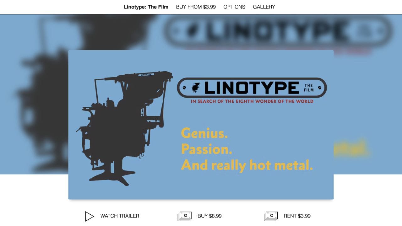
There is also a useful detail to notice: its navigation says “Buy from $3.99”, while the main buttons distinguish an $8.99 purchase from a $3.99 rental. When reviewing your own page, check that the header and the main offer use the same terminology. A clear main section can still be undermined by an ambiguous label elsewhere.
Choose one primary viewing action, then give the trailer a clearly labelled secondary action. If both renting and buying matter, keep both available and explain the difference rather than hiding one in an unclear menu.
This is also an accessibility consideration. The W3C guidance on descriptive link text recommends labels that explain a link's purpose. “Watch the trailer” gives more information than “Click here”.
How do you put the story before the sales pitch?
The JessZilla film site uses a short sentence about its central character above separate film and trailer buttons. The images show the people in the story. The visitor has something specific to connect with before exploring the rest of the page.
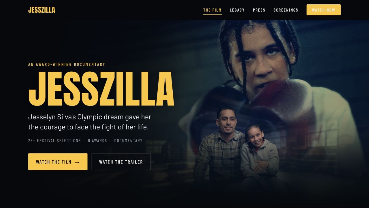
Take the principle, not the artwork or someone else's wording. Name the person, conflict, place or question that makes your film worth a viewer's time. Then let a longer synopsis add context further down.
A useful exercise is to remove the adjectives from your first sentence. If nothing specific remains, work on the subject and stakes before changing the font or button colour.
What is a practical order for the rest of the page?
Build a reading sequence around the viewer's decisions. The following is a starting layout to adapt, not a rule that every film must use.
- Recognise the film. Title, relevant artwork and one clear story sentence.
- Choose a next step. A visible viewing offer and a separate trailer action.
- See the tone. The actual trailer, with a descriptive play label.
- Understand the offer. Runtime, language, available captions, price and confirmed access terms.
- Find a reason to trust it. Accurate credits, a relevant review or verified festival recognition.
- Act or ask for help. Repeat the same viewing offer and provide a useful contact route.
For our fictional harbour film, the short information line might read “42 minute documentary · English audio · English captions”. The offer could then identify a £4 rental and explain exactly when its confirmed viewing period starts. Only advertise captions and access conditions that the actual release supports.
Put the information where the question arises. Rental terms belong near the rental choice. A press kit can sit lower down for journalists. A long director biography does not need to stand between a viewer and the trailer.
How should the trailer support the page?
Use it to help people judge the film's subject and tone. Keep the surrounding sentence consistent with what the video actually shows. Don't make the visitor watch a trailer just to discover the runtime or whether the full film is available.
The official Linotype trailer below is linked from the film's press page. Use it as a companion to the first screenshot: compare the subject and visual identity in the trailer with the promise made by the artwork and page text. This is an example to study, not a trailer to reuse for your own release.
Review your page on a phone with the sound off too. The title, story sentence and offer should still make sense. Let people choose to play the trailer rather than making a noisy introduction the price of entering the page.
Do you need to build a separate film website?
Only if it adds something you need. A dedicated site can give you more control over the page's presentation, press material and campaign links. A hosted film page may already provide the destination you want to share.
Vidreno Films describes a public page with the film, trailer, crew credits and filmmaker profile. You can release a film free to watch or sell it through Vidreno On Demand as a purchase or rental. That gives you a starting destination without commissioning a separate film shop.
The live On Demand page checked on 6 October 2026 lists no required subscription and a flat 10% selling fee plus the payment processor's fee. Allow for both when planning receipts. Vidreno Hosting is the separate service for embedding videos in your own website or app.
If you do keep your own site, give the viewing button a direct route to the relevant film offer. Check that the title, artwork and terms agree across the two pages. Our guide to releasing a feature without an OTT app covers the separate payment and viewing journey.
How can you review the page without guessing what works?
Ask someone who hasn't worked on the film to open the page on their phone. Don't explain it first. Ask them to point out what the film is about, what they would pay, what they would receive and which action they would take next.
| What you observe | What to review |
|---|---|
| They recognise the title but cannot describe the story. | Replace vague introductory copy with a specific subject and situation. |
| They mistake the trailer for the full film. | Separate and label the two actions clearly. |
| They have to hunt for the price or runtime. | Move practical details beside the viewing offer. |
| They expect a download you do not offer. | Clarify the access promise before checkout. |
| They follow a press or social link while trying to watch. | Review the prominence of competing actions. |
Record what happened and what you changed. A few conversations can reveal confusion, but they don't establish a conversion lift. If you later compare page versions, keep track of the audience, traffic source, period and completed action as well as visits. A trailer play, a viewing button click and a paid order are different results.
Check keyboard access, readable text, visible focus and real button destinations alongside that conversation. This is a practical review, not a complete accessibility audit or a promise that a particular layout will sell more films.
Frequently asked questions
What should the page do before the film is available?
State the release status and use an honest next action, such as watching the trailer or requesting release updates. Don't use a viewing button that suggests the finished film is already available.
Can one landing page promote several films?
A collection page can help people browse, but give each film an identifiable offer and direct destination. A campaign for one title should not leave the visitor searching an unrelated catalogue.
Where should a press kit go?
Keep it easy to find through a clearly labelled link. Put detailed production notes, downloadable assets and press contacts there when they would interrupt the main viewing decision.
What if the film has no festival laurels or reviews?
Use accurate credits, strong relevant material and a clear synopsis. Don't invent praise or decorate the page with awards the film hasn't received. The story itself needs to carry the invitation.
Should an email signup be the main button?
It can be appropriate when release updates are the page's actual purpose. Once the film is available to watch, decide whether collecting an address would distract from the viewing action. Explain what people are signing up to receive.
Should the same button appear more than once?
Repeating the viewing offer after useful detail can save readers a trip back to the top. Keep the wording and destination consistent. Repetition should make the next step easier, not create several conflicting promises.
Start with a page a stranger can understand. Give them a specific reason to care, the facts needed to choose and a clear route to the film. Explore Vidreno's public film pages when you're ready to put that offer in front of viewers.